Stencil art is currently very popular and commonly used in graffiti and street art. A stencil can be made out of paper or other media to create an image or text that is easily reproduced. I'm a big fan of street art and am looking forward to recreating similar effects using my own stencils. All forms of media can be used with stencils, spray paint being the most common due to the speed street artist can get their work on the wall and be out of there before anyone sees them! In this project we were asked to produce work based upon portraits or figures. After the paper cutting workshop I was looking forward to being let loose with my scalpel again and cutting out some more intricate images.
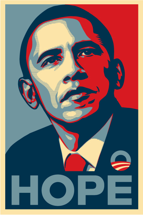
American contemporary artist Shepard Fairey made a series of posters using stencil art supporting Barack Obama 2008 candidacy for President of the United States. I think this is a great example of how taking a really simple image works really well with stencil art. I like the use of colour on this piece, I think the placement of colour is interesting, with half of the background in blue and the other in red where the shadows would fall, which helps to add realism to this poster. I enjoyed reading about all the controversy surrounding this poster as I was researching it, I like the fact a lot of stencil or street artists work is based on controversy, sometimes in the subject of their work and sometimes even just placement of their work, some people viewing their work as graffiti. I don't know much about the artist but would image he would edit his photos on Photoshop initially to make it easier to make it into a stencil, similar to what I will be doing with my stencil art. I really like the text on this piece, I think using stencils for texts looks really effective, although not part of the project brief I think I will have a quick experiment with stencilling some text.
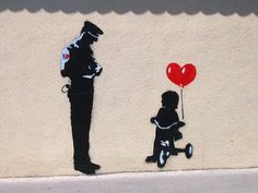 I think it would be impossible to analyse the work of other stencil and street artists without looking at some of Banksy's work. Not only is his stencil work instantly recognisable and beautifully created he also manages to add a lot of humour and current social and political issues to it. I really like this simple piece of his in which a police man appears to be giving a little girl on a tricycle a speeding ticket, I imagine this is an insinuation to how corrupt the law can be now, and of course pretty much the only colour to this work is the red heart balloon, reminding us to love. I would think this stencil was only made up of a couple of layers, the black, blue and white which would most probably be spray paint. I think the simplicity of the stencil adds an impact to the overall image. Banksy sometimes uses features that are already on a wall or even previous work of other artist that he then builds his image around, often creating some hilarious outcomes. As an artist I think Banksy provides something that everyone can enjoy and quite often brightens up some miserable places with his stencil work.
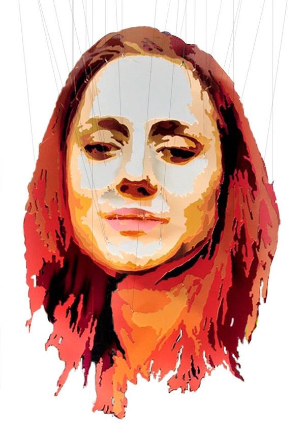 Although not stencil art as such, this artist has used posterization in this piece of work. Posterization is change of a continuous gradation of tone to several regions of fewer tones, with abrupt changes from one tone to another, this is an effect that can happen accidentally or be created purposely for effect. Simplify the change in tones in images can help when it comes to cutting out images for stencilling or other techniques. On first glance this image looks like it could of been painted or even created on a computer but on closer inspection you can see it is actually many cut out layers of acrylic that have been hung to create this portrait, when looked at from head on. I think this is genius and most of took some planning to get it so perfect. This technique is similar to stencil art as the artist will still have had to cut out the image but instead of cutting out what is to be coloured, its's almost as if he has kept the negatives to then build up the over all image. I think the subtle change in tone, from very light to dark adds to the effectiveness of this piece. I like the amount of layers of posterization the artist has used and would be interested in working towards creating something as complex. 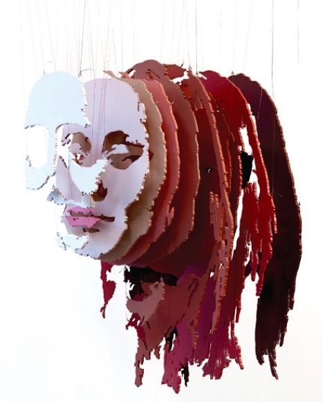 We were asked to create stencil art based upon portraits or figures. I chose to experiment with two images initially and develop my favourite further. I picked a portrait of a model and one of a model wearing a voluminous dress. In order to cut these images out as stencils I first needed to use what is called posterisation in ordered to simplify my images, I took both images to 3 levels of posterisation which gave me 3 tones that I could then cut into 3 different stencils. Here are my images after posterisation, I am now ready to transfer each layer onto 3 separate sheets of Tyvek, which is more durable than paper and will hopefully let me produce several different prints. I carefully cut out my stencils making sure I had thought about everything connecting, I had almost created a positive and negative image for my stencils, one would print where I had cut out and the other would be coloured around the stencil that was stuck down and when removed leaving the white shape and the colour would be the outline. I tried both these stencils in shades of grey to evaluate which image was more successful. I think the stencil of the models face worked much more effectively than my other stencil, it was also a lot easier to work with as it was a standard stencil and not so fiddly as the other one was, having to make sure little pieces of stencil were stuck on in the correct place. I then used my final stencil to produce different effects using different media. I used some dry media like coloured pencils to colour my stencil in and also experimented with dots and lines for a different effect. I didn't think these looked very effective and wanted to use more wet media. I also tried water colour paint but wanted a stronger colour than I can produce with them. I really enjoyed working with the spray paint and think it is the most effective media for this out of everything I used. I also wanted to experiment stenciling on other backgrounds, I cut out some pages of fashion magazines that I think worked well with my image. I really enjoyed working with stencil art, I think as it is something I'm already interested in I was excited to have a go myself. I was inspired by the simplicity of the work produced by stencil art but also how detailed and effective it can be. I like that there can be a lot of controversy within it too. I learned a lot about how stencils work and the images they create, I found it can be quite a simple process, especially when it comes to street art and must work fast, I assumed they spent a lot more time spraying their work free hand. I would be interested in taking stencil art further and using it in future projects, I would like to try stenciling on fabric and incorporate it into a garment. In future work I think I should spend more time when applying the colour, sometimes having a tendency to rush and therefor not getting as crisp image as possible, I could also wait longer in between layers as sometimes my last layer wasn't quite dry and I think that showed in some of my designs. Although not part of the workshop I wanted to quickly try some text using stencils, just to see what kind of effect is available for future reference. Thinking of branding, I chose a short hand version of my name and cut it into Tyvek in several nice fonts. I like the effect I was able to create with the stencils but found it much harder to cut out text than I did with my image. I tried my stencil in a variety of colours and also tried it layered with the stencil I used for the work shop. I like what I created and think it would be interesting to use inside or outside of garments I make as a label. 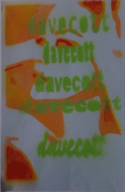 I really like the way my stencils look after all the different paint has dried on them. | AuthorWrite something about yourself. No need to be fancy, just an overview. ArchivesCategories |


 RSS Feed